Blackbook builds brands you can recognise across everything they touch. A strong visual identity is not a logo – it's a coherent system of name, colour, typography, imagery and tone that makes a company recognisable from the first encounter to daily operations.
We develop identities that survive real life: flexible enough for new channels, disciplined enough never to blur. We use AI to accelerate visual exploration – more directions tested early, before the choice is locked in.
A brand is a decision, not a decoration
Branding, logo design and visual identity – from strategy to brand guidelines
The best identities don't start with sketches but with a choice: what should the company own in people's minds? Positioning shapes the visual language – not the other way round.
From there we work outward into the concrete: logo and logo system, colour palette, typography and image style, gathered in brand guidelines that make the identity easy to use well – including by the people who join later.
Naming: the first design decision
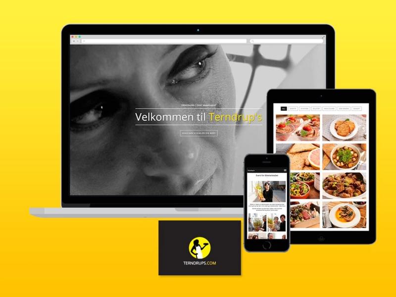
The name is the part of the identity everyone meets first – and the hardest to change later. We develop names that are short, pronounceable, digitally ownable and have a story to tell. Names like Valiyou, Terndrup's, Madame Carlsens Café and Bistro Sorte Hest came out of that process – together with the identities they carry.
What we do: Visual identity · Logo design · Naming · Brand strategy · Brand guidelines · Rebranding · Identity for digital channels
Larger campaign roll-outs are handled with trusted partner agencies.
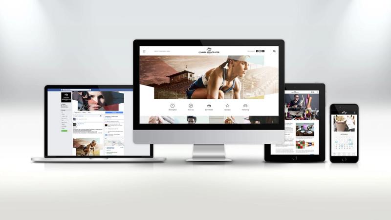
One identity, every surface
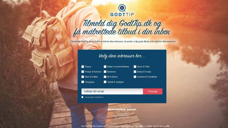
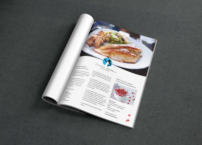
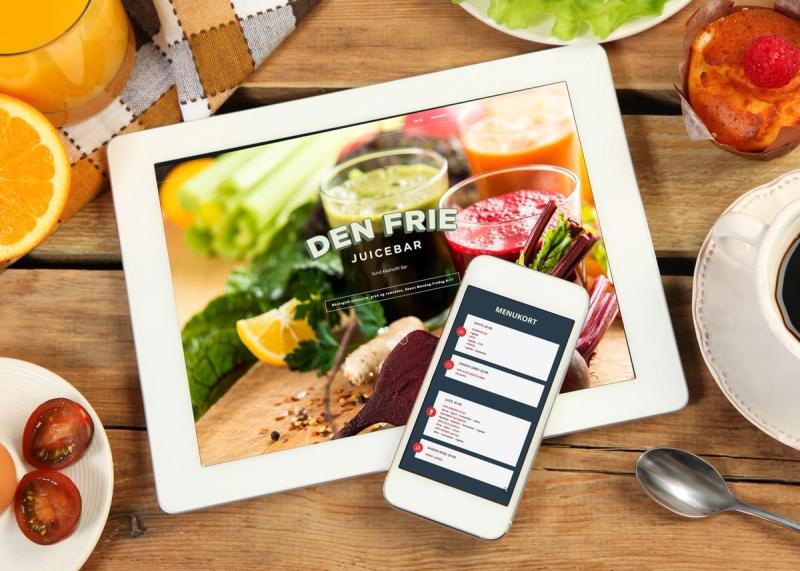
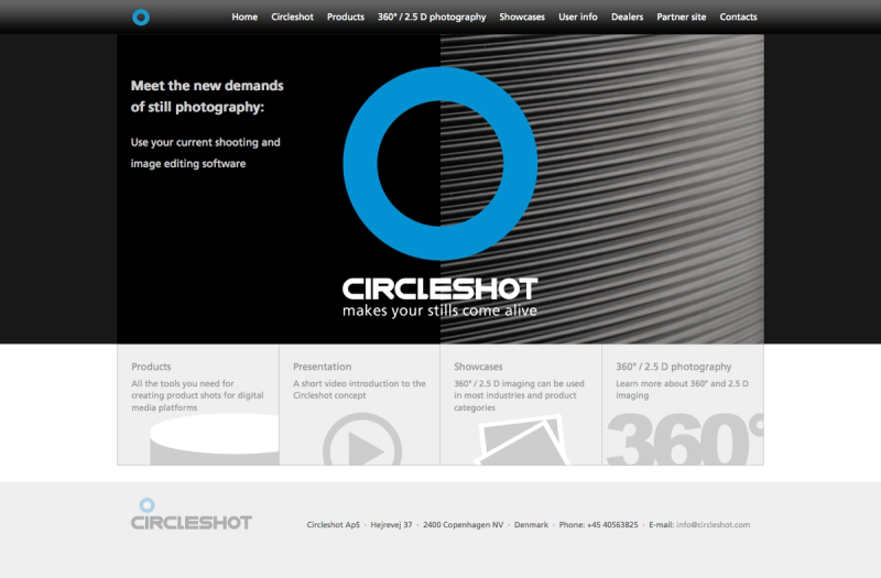
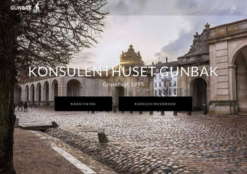
What the cases in the gallery share: the identity had to work as hard on a menu or an app screen as on the façade – and be usable by people who weren't there when it was made.
Facing a new brand – or one that needs tightening up? Let's talk about your project.