Data is only valuable if it can be read – quickly, correctly and without a manual. Blackbook designs data visualization where numbers become decisions: dashboards, statistics and complex datasets translated into graphics you can act on.
We use AI to test visualization forms against real datasets early – so the choice of chart is made on content, not habit.
A chart is a claim
Data visualization, dashboards and interactive graphics
Every visualization highlights something and hides something else. So we start with the question the data has to answer – what should the user be able to see in three seconds? Only then do we choose the form: curve, distribution, map or something else entirely.
It sounds banal. It isn't. Most dashboards fail because they show everything the system can deliver instead of what the user needs.
From clinical data to payroll figures
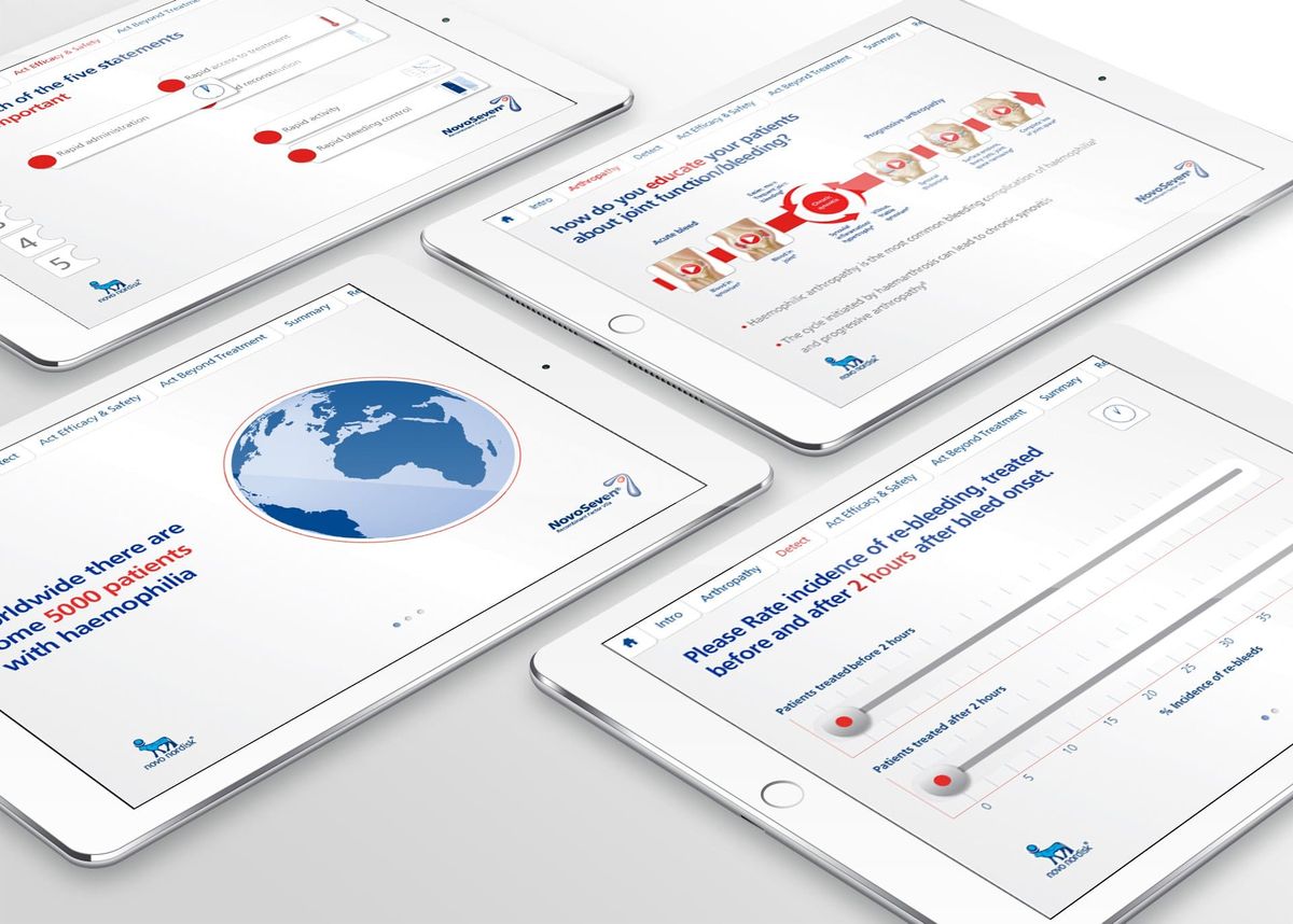
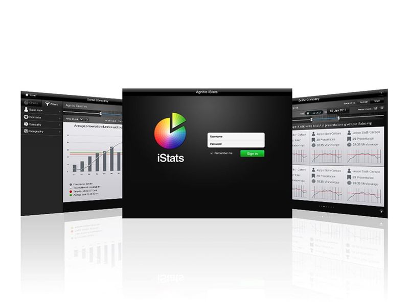
We've visualized some of the most data-heavy domains there are: clinical data where precision is a legal requirement, sales statistics for global pharma organisations, payroll and business data in real time, and banking products that need explaining with numbers. The shared method: reduce, prioritise, and let the numbers speak at the user's pace.
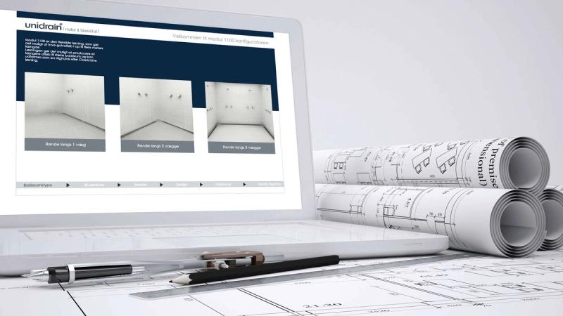
What we deliver: Dashboard design · Interactive data visualization · Statistics & report views · Real-time data in UI · Configurators & calculators · Visualization systems & graphic guidelines
When misreading has consequences
Our visualizations are used where a misreading costs – clinical data, financial figures, sales numbers that drive decisions. That demands precision in both data and design, and that combination is exactly what we're built for.
Do you have data that deserves to be understood? Let's talk about your project.