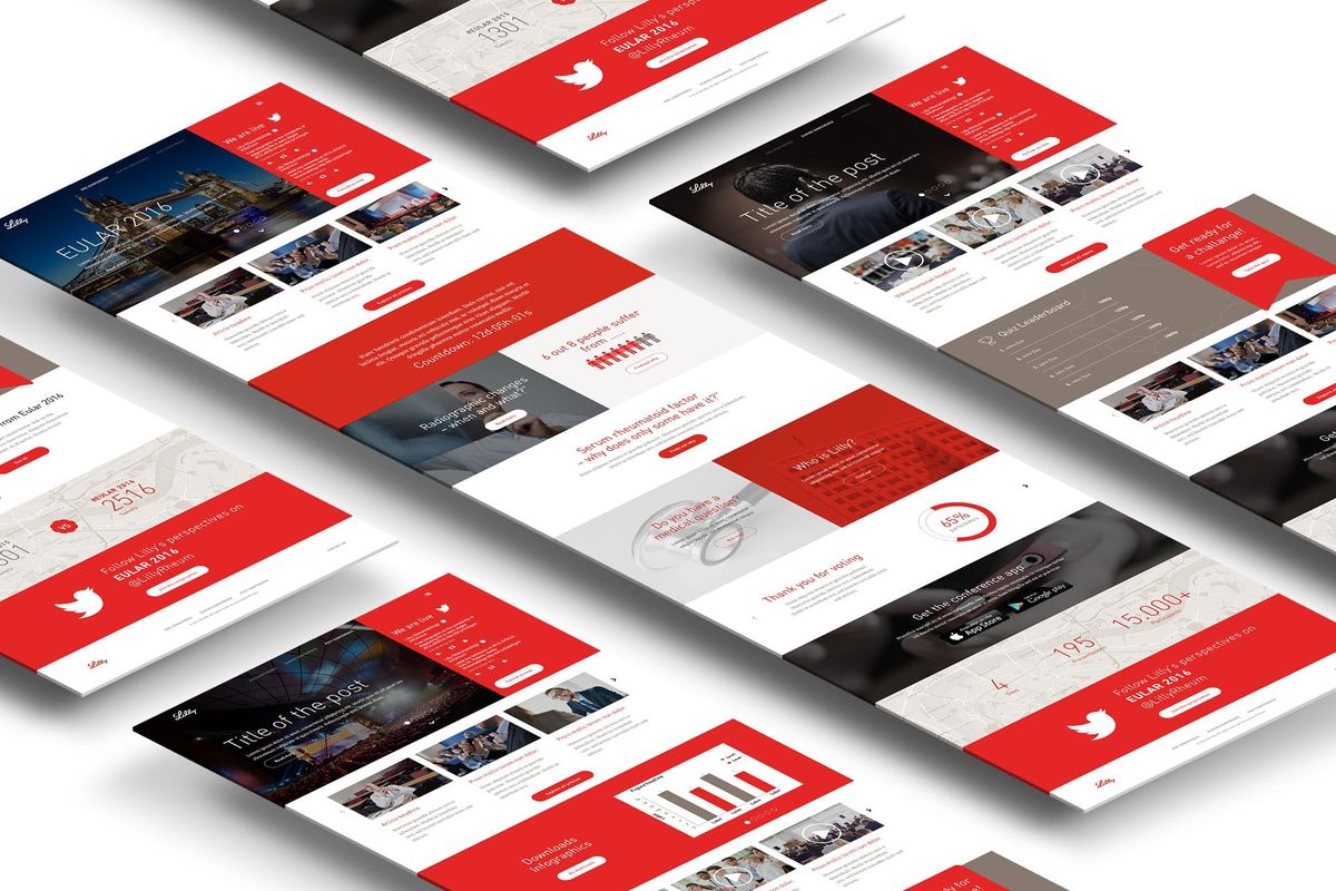
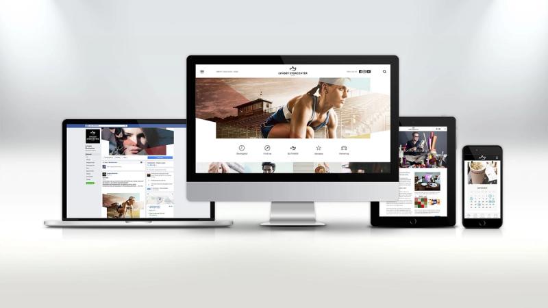
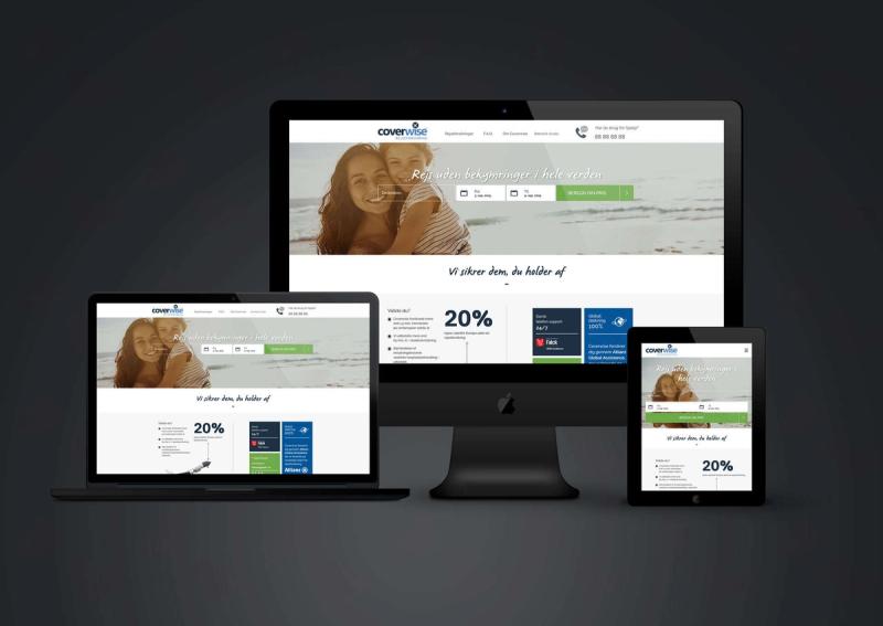
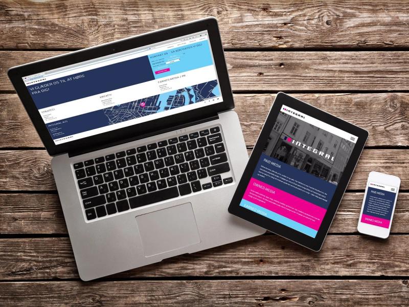
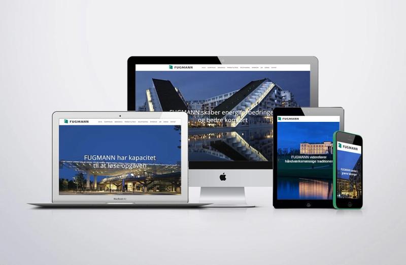
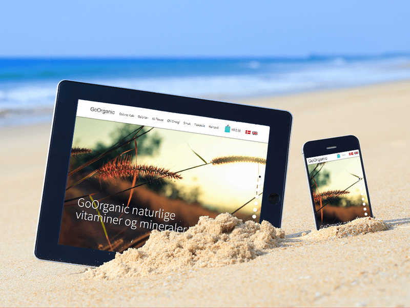
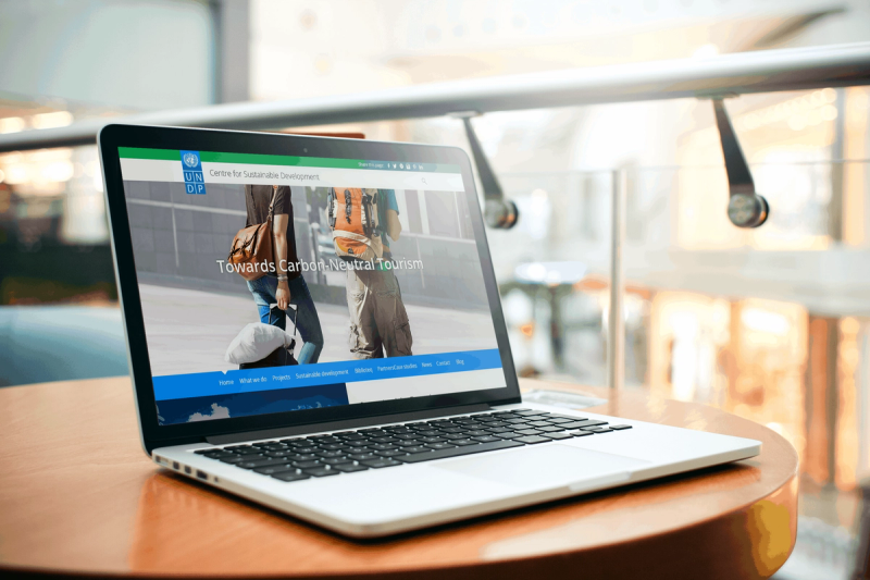
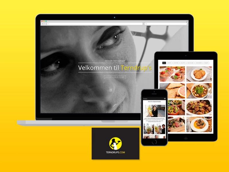
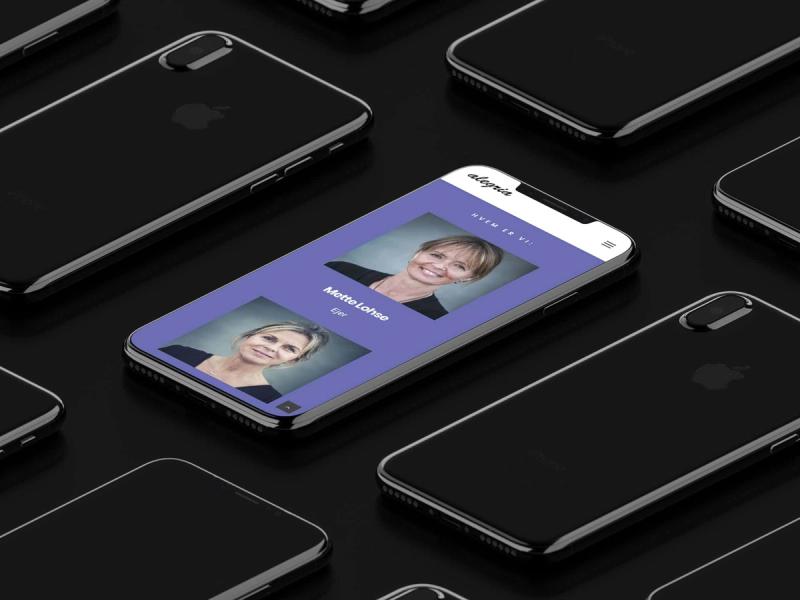
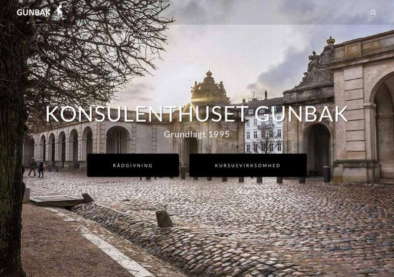
Blackbook designs responsively — not as an add-on, but as a starting point. Every design we make works across desktop, tablet and mobile, because we think in flexible grid structures and scalable components from the first sketch.
AI helps us test and validate responsive layouts faster — from automated viewport testing to intelligent content reordering.
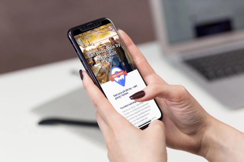
Mobile first is not a buzzword — it is a design decision
Responsive web design across all devices
Most websites are visited more often from a phone than from a desktop. We design with that reality: content, navigation and interaction designed for the smallest screen first, and enriched from there. Not a desktop site shrunk down, but a mobile experience that grows.
Performance is part of the design
Responsive is not just about layout — it is about speed. Images that scale, fonts that load correctly, and interactions that feel native on any device. We optimise for Core Web Vitals as part of the design process.
What we deliver: Responsive web design · Mobile first · Flexible grid systems · Scalable components · Touch optimisation · Performance optimisation · Cross-device testing
For all digital solutions
Responsive design is not a service — it is a standard. We deliver it as an integrated part of every website, app or platform project.
If you need a design that works everywhere, let's talk about your project.